Buckets 0.39: Now with Less Clicking
Buckets version 0.39.0 has been released. This version includes a few long-awaited changes. Parts of the UI have been cleaned up, and a few new features are available for those who manually enter transactions.
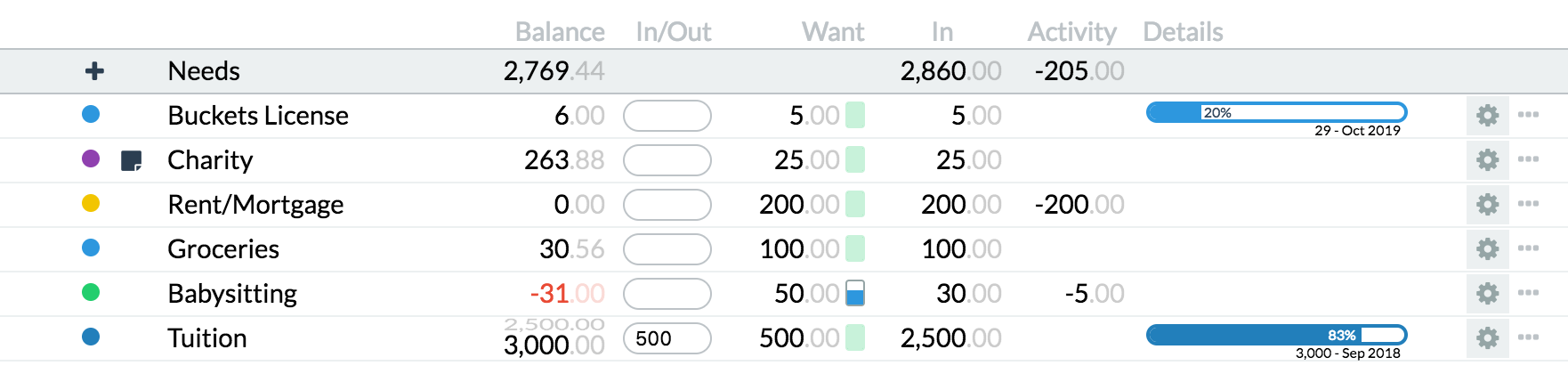
Cleaner Buckets tab
The Buckets tab can breathe again!
-
There are fewer vertical lines.
-
Each bucket balance is now the first column after the name so that it’s easy to see how much you have in each bucket at a glance.
-
The “Out” and “Transfers” columns have been combined into a new “Activity” column.
-
When you put an amount in the “In/Out” column, the balance column used to grow wider to show how the balance was going to change. For instance, if you had $97 in a bucket and wanted to add $26 it used to look like this:

Now, to avoid having columns grow suddenly wider it looks like this:

Improved transaction entry
It used to take a lot of clicks to record a transfer between two accounts. Now you can do it very quickly using the transaction entry interface:

And you can also categorize as you create transactions.
Refunds and returns
Sometimes the math didn’t seem to add up right when you’d get a refund/return on a purchase. Suppose you had a bucket with $100, spent $20 then got a $10 refund. If you categorize that like this:

Buckets used to say that you spent $20 and had $10 of rain. Now it says you have $0 of rain and only spent $10. Potatoes, potatoes.
Oh, and one more thing: yellow buckets use black text on their category labels now (so you can actually read them!).

Happy budgeting!
— Matt
Comments

